UCLA Poster Presentations Guide: This resource provides a comprehensive guide to creating effective poster presentations for conferences and showcases and also includes resources for poster printing on UCLA campus for UCLA students.
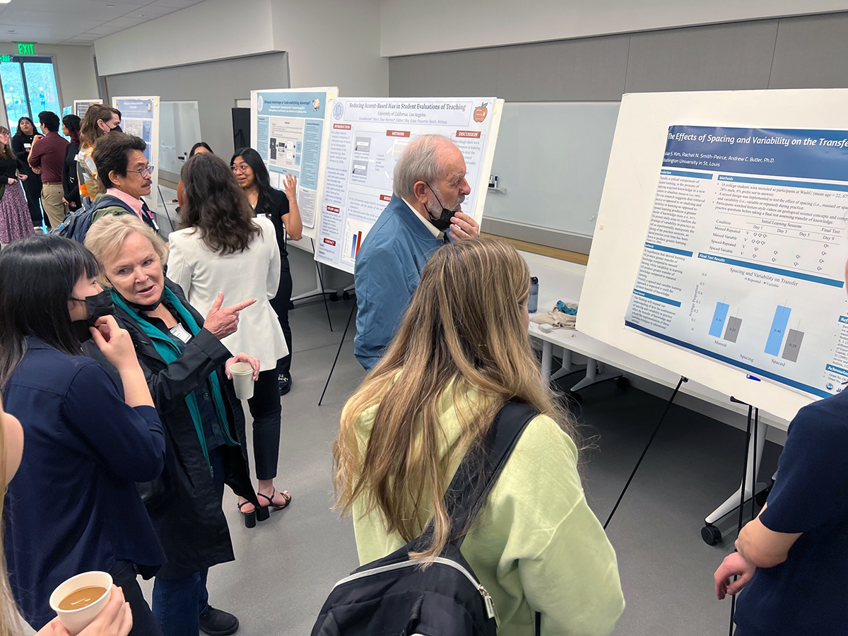
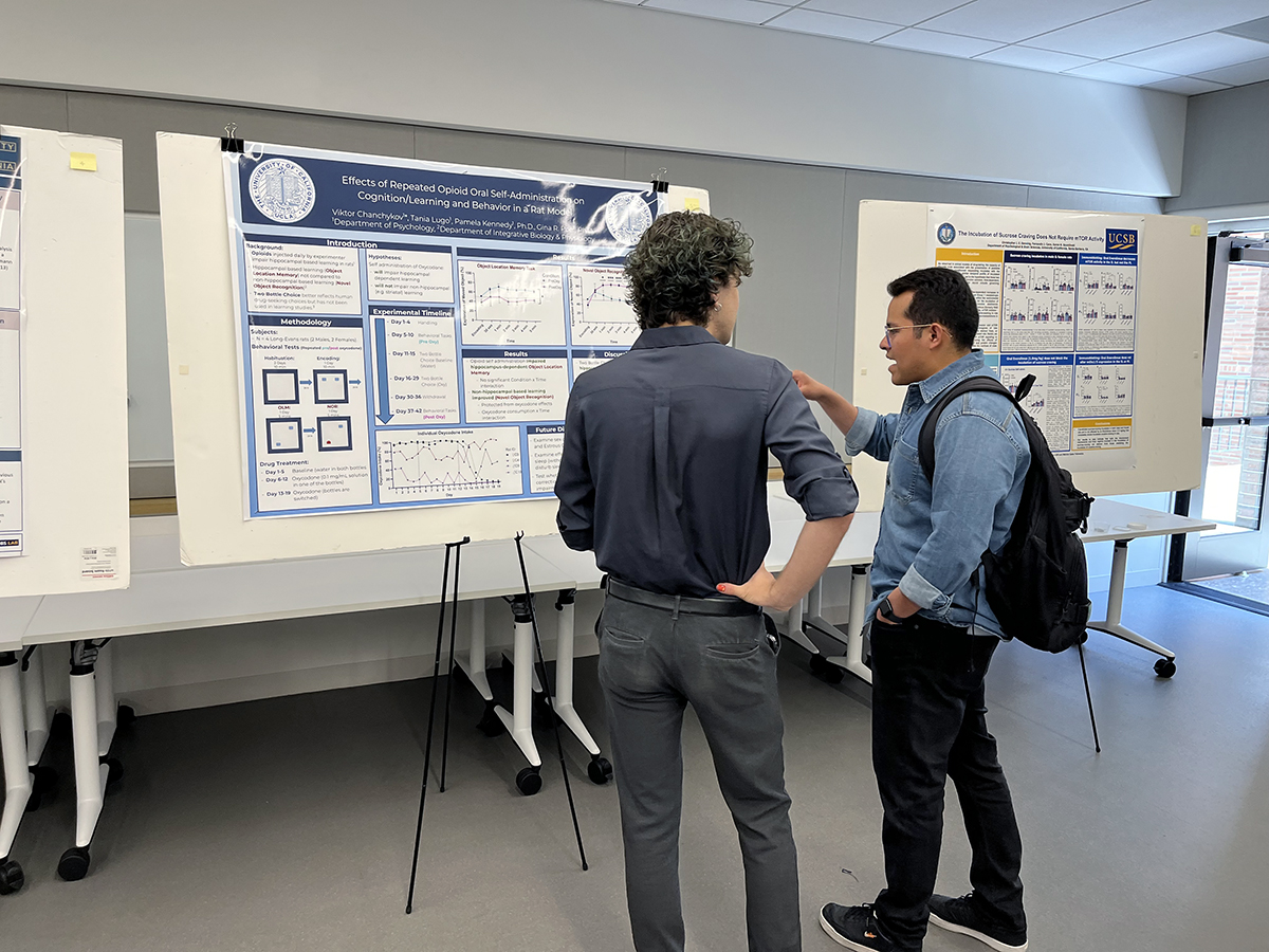
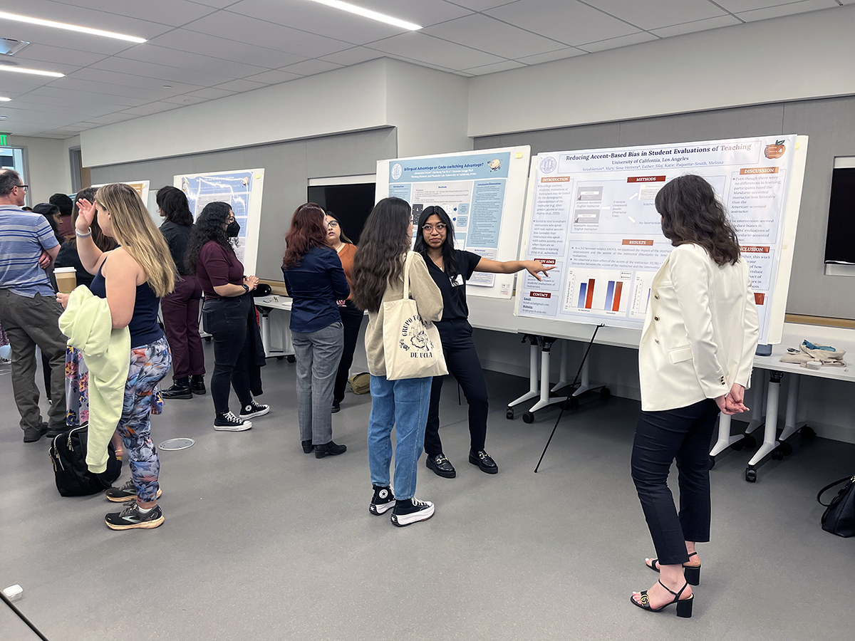
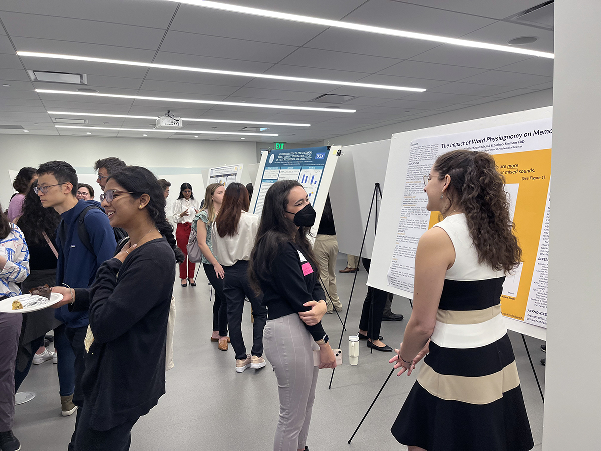
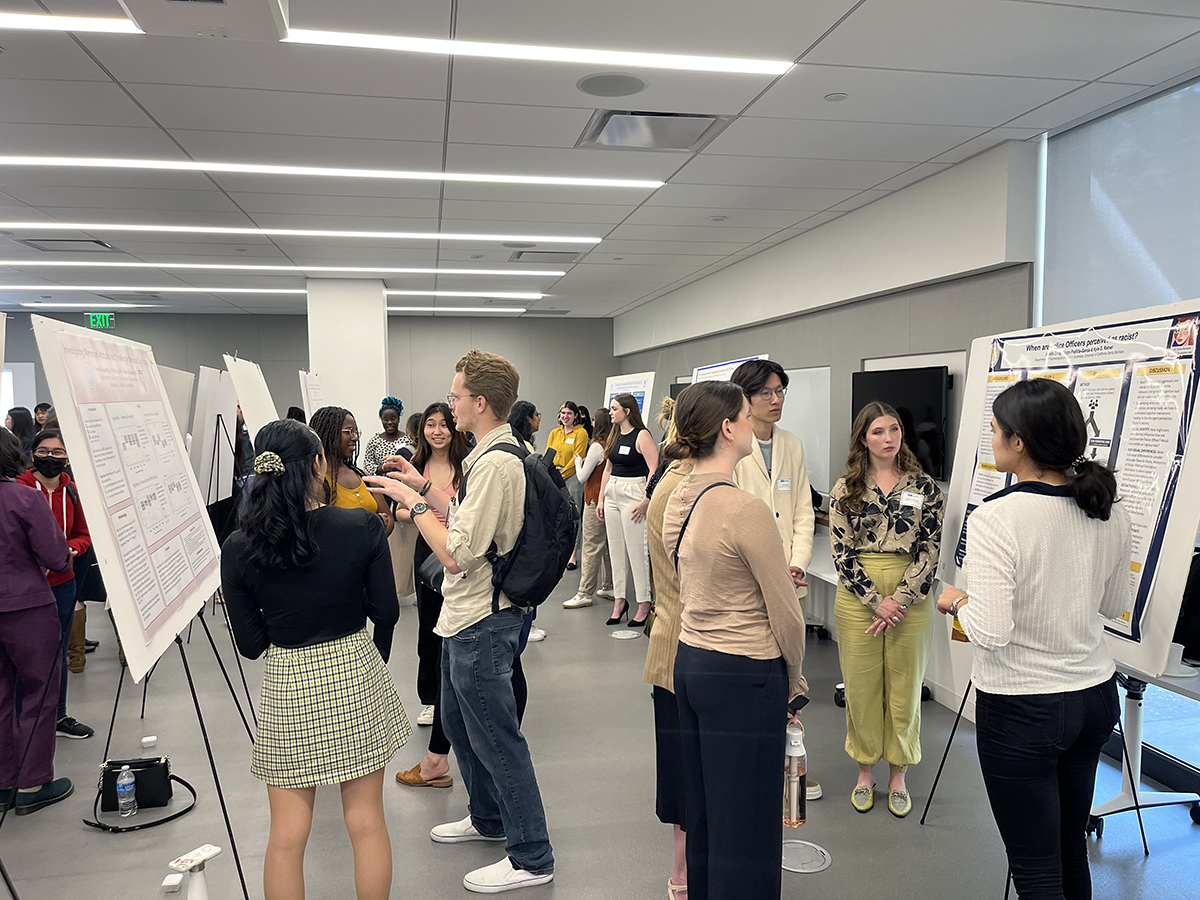
- Poster sessions will be held in Pritzker Hall. Easels with foam boards will be provided for you to affix your poster. The foam board measures measures 60” wide by 40” high. You will stand next to your poster during your session to answer questions about your research.
- Your audience will include anyone who comes through Pritzker Hall to look at the posters. These people may include other participants and their guests, UCLA faculty, graduate students, undergraduate students, and staff.
- Nothing will improve your level of comfort and confidence more than practice. We suggest you have several people read your poster to give you feedback and to ask you questions.
- You should not bring additional equipment or props for your presentations out of respect for neighboring presenters.
- Do not bring anything for attaching your poster or poster materials. We will provide an adequate number of push pins in addition to binder clamps for sheet posters.
- Do not pre-assemble your poster on a poster board or foam board. Our poster frames already have foam board and cannot support heavy materials attached to them. If you want to pre-assemble your poster, do so on light butcher paper.
Poster Printing
- If you are interested in creating a printed 1-sheet poster, research your local or campus printing resources. Posters can be enlarged and printed from PowerPoint slides or PDF images.
- Resources
- Psychology Tech Services
- ASUCLA Custom Print Shop (inquire on A-level of Ackerman Union or email custom@asucla.ucla.edu)
- Spoonflower – Fabric poster printing
- Professional printing options are not necessarily cost efficient. It’s your decision on how you will prepare your display.
Poster Content
- Posters should be easy to read and should not be crowded. Only essential information should be included. Be concise. Text should be legible and in dark print. Include graphs, tables, illustrations and photos.
- The layout of your poster is entirely up to you. Although all posters usually contain the same research elements, there is not a standard way of creating the poster design.
- You can use these sample layouts, or you can work closely with your faculty or graduate student advisor to create a unique design that suits your research project.
- You can create printed 1-sheet posters or create a poster layout using individual pieces. Both options are common and appropriate for PURC.
- You are limited by the 60” by 40” poster space. Your poster can be smaller these dimensions but not larger. A good poster contains blank space. Use the empty spaces to visually organize your poster. To find the most effective and pleasing layout you should test your poster at full scale.
- Information to Include
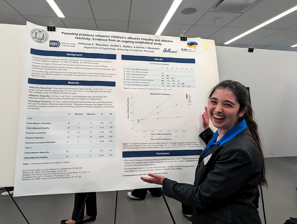
- TITLE Your title announces you and your work from a distance and should be printed in letters that are 1-2 inches high. It should be followed by the name(s) of the student author(s), faculty sponsor(s) and the academic institution.
- HEADINGS Main headings can be used to carry essential information and provide a “take home” message.
- INTRODUCTIONS A succinct synopsis of the relevant theoretical background should be provided.
- ABSTRACT A brief summary of your study should be included in your poster.
- METHODS Describe subjects, design, tasks and procedures. Your variables should be clearly defined.
- DISCUSSIONS AND CONCLUSIONS Provide a concise explanation of the significance of your results in the context of the theoretical background developed in the introduction.
- REFERENCES Include only essential references, as these break up the visual flow of the text and take up valuable space on your poster.
- RESULTS Graphs, figures, and tables are ideal for presenting results. Text should be used sparingly. Short figure captions can be used to help the reader understand the data presented.

